Back in the old days about 20 years ago I received the advice "Don't use too many fancy fonts." Well as it was regarding writing missionary prayer letters I thought it a little odd; after all, pictures help keep the readers' attention. But as a Baptist, I was hardly likely to put images of fonts on my letters. Time passed and I thought no more about it. Then I discovered computers! And fonts!!! Lovely, elegant, curly ones; thick, bold official ones, and comical curvy ones. Wow! The temptation to decorate every document with a series of fancy fonts was immense. It was then that I remembered the advice and suddenly it all made sense! OK - no more fancy fonts. Except at school it is fun to find amusing fonts for classroom displays. Today I enjoyed Jokerman:

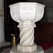
So it got me thinking why "font"? What is the link between a piece of ecclesiastic furniture and a typeface? Well there isn't one. The church font is related to the word fountain. And the typeface font is from the old French word fondre which means melt because the letters were cast or melted together. But it is amusing now to find that the typeface font is the first that comes up in a google search. You can only find out about the other kind of font by calling it a church font.

But isn't the root of fondre the Latin word 'fundere' - "to pour forth" - the same root as that for fountain?
ReplyDeleteEqually fascinating, we use our font in a piece of text - which comes from 'texere' - to weave or fabricate - same root as texture and textile.
I could spend all day immersed [baptised?] in the dictionary!!!
OOH - my word verification is Trodat - a make of printer. How wierd is that?
The temptation to use fancy fonts for displays is strong but please don't over do it. The advice you had so many years ago still stands, even for your displays. A little fancy goes a long way :-)
ReplyDelete